
Wednesday, May 13, 2020
Experiment Two: The Bridge
Theory
Dynamic lighting can dissolve notions of rigidity and boundaries, thereby enlivening how people interact with or perceive a
space.
The bolded words were the ones I selected from the article: "FLOW Architecture Designs 'Light Falls' Victorian House In Kensington". 2019. Dexigner. https://www.dexigner.com/news/32615
With a theory based around light, I focused on manipulating both the direction and amount of light coming into certain spaces, depending on their purposes. My model was also dominated by many off-set small spaces which people can see through which would instead, provide a sense of a larger space.
Sketch Perspective Drawings
These drawings were done at an earlier stage of the design process and therefore, look quite different from my final model.

View from the front (where 'front' is the entrance to the building)

View from the right

View from the back
Animated Drawings

Axonometric gif

Axonometric still

Two-point perspective gif

Two-point perspective still
Custom Textures
For the 3 additional words, 2 were taken from my original theory (fluid and dynamic, although I removed fluid in the final theory).


'Linear' texture used to signify vertical movement

'Scalar' texture used to signify transition to a more private space (e.g. studio)

'Fluid' texture used to signify transition to a more public space (e.g gallery)
Moving Elements

Shutter screen, thin shutters to mirror the appearance of the mesh surfaces
Moving 'bridge' to NIDA, includes extendable wall to attach to buildings (the gif file was too big to play properly so I made it a video instead)
Use of Space
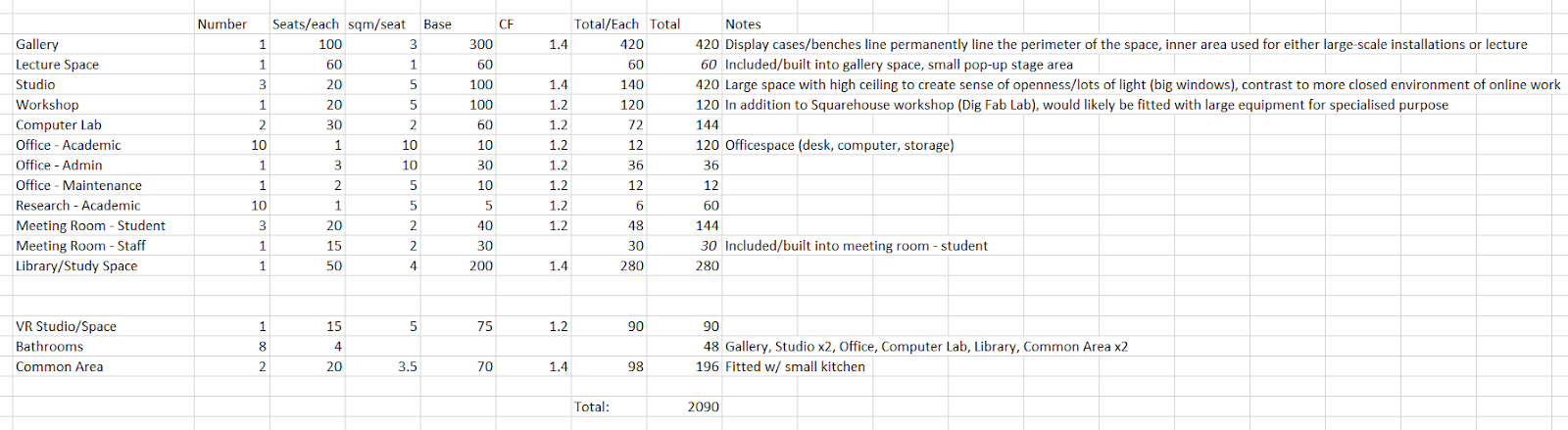
As I developed my model, I tried to stick to my original sizing plan. Some changes were made as I had to adjust aspects of the model, but overall the size stayed fairly similar. One notable change was in the common area. Originally, there were two interior common areas, however, I felt that some of the space on top of the individual blocks could be used instead as an outdoor area. The fairly large area of my model is likely because it is a collection of small spaces. As a result, there is a higher proportion of circulation space per room.


Orignal sizing plan

Final sizing plan
Final Model
SketchUp 3D Warehouse: CHEN_Lily_ARCH1101_EXP2
Lumion Environment: https://drive.google.com/file/d/1lML7x_lRlTsly9aRqsYM8CdOYUVU0L0j/view?usp=sharing
Flythrough animation
The structure is primarily made of glass and light-coloured concrete. In accordance with my theory, glass is used throughout the structure to both allow in light and to alter people's perceptions of space, as they can see through to other rooms. Similarly, the light colour of the concrete allows shadows produced by the light to be more prominent. To allow for light, as well as privacy, both mesh and translucent glass are also used. A shutter is fitted on the library/study area that mimics both the function and appearance of the mesh. However, the shutter is a moving structure that allows users to have control over how much light they wish to allow in.

Perspective image (1)

Perspective image (2)

Perspective image (3)
Private spaces (e.g. offices and computer labs) have lower ceilings. More public spaces (e.g. galleries) and some workspaces (e.g. studios) have higher ceilings to grant a stronger sense of openness.
The academic staff offices are placed on the other side of the interior common area, away from the public galleries so that further privacy is maintained.

Academic staff and research offices, translucent glass back walls

Interior of office space

Administration office

View through to interior common area and studio (further)

Interior common area

Studio

Studio overlooking meeting room, mix of translucent and transparent glass

Glass walls of computer labs and gallery space

Computer lab

View through to gallery and lecture hall

Lecture hall

Gallery space, glass display cases

Displays on walls, elevators to entrance

Mesh fitted onto glass corridor

Surrounding windows, view through to gallery and workshop

Shadows produced by mesh, display cases for student work

Workshop, fitted with large equipment for specialised purposes

Shutter at maximum opening
One key aspect of this structure is the library/study area. In the future, it is likely that most text resources would be available online leaving most libraries obsolete. Therefore, in this structure, the library is primarily a quiet study space with a variety of different study spaces.

Bookshelves may still be needed for older books that are more difficult to make available online, standard table study area

Seated study area directly facing window
The structure connects to Squarehouse and, currently, NIDA. As my other moving structure, the bridge to NIDA is intended to be a 'future-proof' aspect of the structure. Over time, development is likely to occur across Anzac Parade this bridge structure can be used to connect to a range of buildings. To account for the different heights of buildings, the bridge attaches via an extendable wall.

Connection to NIDA via a moving bridge and extendable wall

Connection to Squarehouse via workshop, close proximity to Squarehouse workshop
Two notable features of my structure include are the exterior common area and the VR studio. The exterior common area somewhat decreased the size of the structure as one of the interior common areas was removed. One growing aspect of architecture is VR technology. As a result, I added a large VR studio to the structure, placed near one set of computer labs.

Exterior common area

VR studio
Sunday, April 19, 2020
Plan
The plan I selected was Zaha Hadid's Riverside Museum. The peculiar shape of its roof lends itself to an interesting shadow, which would contrast with the light from the large windows.

The first modifications I did were rather basic as I focused on how to implement the spaces into the pre-existing shape. This caused many of the spaces to be slightly out of proportion in order to conform to the shape. I also found that colour coding how space was used made everything a lot easier to visualise, a technique I went onto use in the current iteration of my SketchUp model.
 As my initial modifications were minimal, I redid the task and started by changing the shape of the structure. While most of the shape was altered, I took into consideration the general features of the museum, such as its curved aesthetic. This also led to the shapes of the individual spaces to become more visually engaging.
Sunday, April 5, 2020
Perspective Drawing and Theory
Revised Sizing

Perspective Drawings


Lumion

Architectural Theory
Words: fluidity, enlivens, dynamic, dissolves
As fluid designs can dissolve traditional and rigid
dynamics, they can effortlessly, but crucially, enliven how people interact
with or perceive a space.
"FLOW Architecture Designs 'Light Falls' Victorian House In Kensington". 2019. Dexigner. https://www.dexigner.com/news/32615.
Subscribe to:
Comments (Atom)